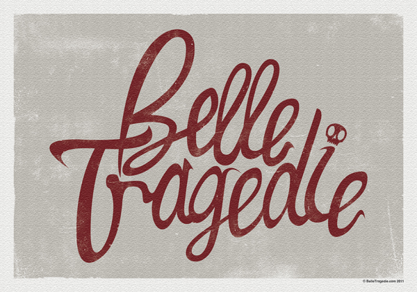
Among other various things, I’ve been working on an idea for a logo to use on any illustrations or promotional material. I wanted it to be fairly illustrative looking with an element of my own style in there. Also as my style has changed from gloomy gothic to more dark and playful, I wanted this to reflect in the logo too.
Once I had a font that I liked I started to play around with the letters individually, making sure they looked right and flowed into each other to look like a logo rather than a font. Extra curves and flicks were then added to give character to the lettering.
I’m starting to get excited about stickers and stuff now!!!!


