Illustration Archives - Page 5 of 5 - belletragedie.com

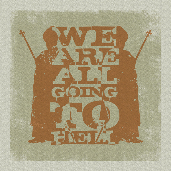
We Are All Going To Hell

Illustration, Life, Religion

We are all going to hell

I’m not a religious person. I like the art, imagery, statues, cathedrals, churches and the theory of it including the way it gives people hope or helps people focus on something when they don’t have anything or are in troubled times. The catholic church, kind of the Bang and Olufsen of religions,  has always been a bit of a dodgy subject. And theres something not quite right about it that has always bugged me.

Jesus washed peoples feet, and lived in a shed or cave or something right? And rumour has it he was a bit of a magician. So why does the Pope live in an almost golden city with mafia like bodyguards? Hmmmm. This led me to looking up on t’internet what the Pope’s salary is and if he gets Christmas bonuses for being extra pope-like? Turns out he doesn’t have a paycheck like us regular folk. He doesn’t even need money in fact. He is almost above money. Something not right there hey?

Anyway this quick little illustration/print is what spawned from these thoughts. See you all in hell!!!

1 colour or 4 colours sir?

Illustration

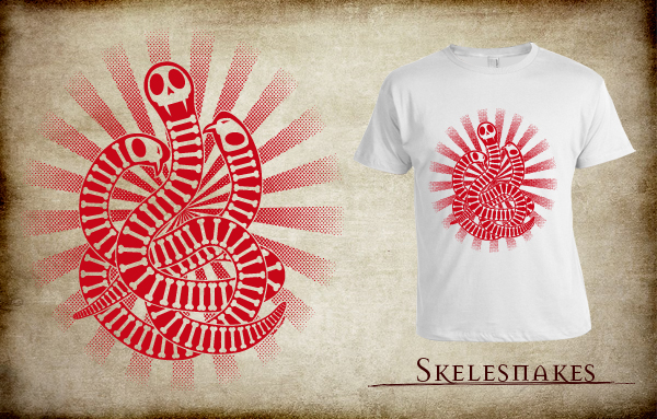
Skelesnakes

The brief for this t-shirt was to produce an image in 1 colour with no transparencies or gradients. Usually when working with 4 colour CMYK  it is easy to make images stand out with different tints or stroked outlines, but with 1 colour it takes a little more thought. Everything has to be planned.

Edges of shapes that touch each other can become merged and everything starts to look like a blob of colour. In this case I used a stroked line around each section which was then subtracted from the main image to show the background through thus acting as an extra colour, but not an actual colour if you see what I mean?

Also  Shading to show darker or lighter areas and gradients can’t be used, so in this image I used half-toning in a starburst shape around the edge of the main image focus to add a gradient look. This tricks the eye into thinking it is fading out at the edges when really its just smaller ink drops. Simple but effective.

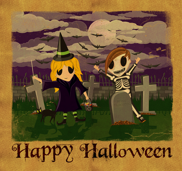
Happy Halloween!!

Illustration

Halloween

For those of you who know me well, you may recognise the characters in the picture – even the cat. I’m off to find things around the house to try and make a halloween costume, I’ve been a bit slack halloween-wise this year. Happy halloween Everyone!!

Courage over Weedkiller

Illustration

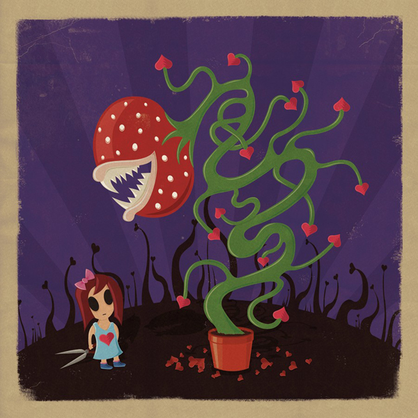
Courage

The naming process for my illustrations varies each time. Sometimes I have a title from the start and the image is based around this, sometimes it may come to me half way through and occasionally I am left at the end with a couple of titles.

This was the case in my latest illustration, in which I settled on “Courage” as the title. I had a mixed bag of titles at the end including, Valor, fearless, spirited and ‘weedkiller’. Weedkiller I actually had weedkiller written down. I like to think my images have a thought provoking feel to them, so naming it ‘Weedkiller’ would have been an ill-thought out, sleep/caffeine deprived idea.

Anyway, Horray for Courage!! ~ enjoy!

Website Resurrection!!

Illustration, Life

Welcome to the recently refurbished BelleTragedie.com. It’s taken a while, mainly due to me being  visuals guy rather than a techie guy (DAMN YOU CSS AND WORDPRESS!!!). But I finished it at last and I’m pretty pleased with it. I decided to go for a simpler look with a style that fits the new direction in my illustration – one I hope to develop even further and define my style even more

It’s been a mental few months. And in between getting married, going on a honeymoon, celebrating a bunch of friends hitting 30 and a full time design job I haven’t had much time to concentrate on the website or blog. Somewhere amongst all that crazy stuff I managed to delete all my previous blogs, ….yeah good one. So I’ve decided to start a fresh and this is the first of the new blogs. I have some wicked awsome projects coming up over the next month or so which I’m really excited about, so hopefully I’ll keep up to date with blogs and uploading new artwork.

If you like any of my illustrations and have any comments or if you think my style could work with a project you have I would love to hear from you.