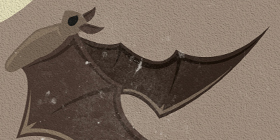
The brief for this t-shirt was to produce an image in 1 colour with no transparencies or gradients. Usually when working with 4 colour CMYK it is easy to make images stand out with different tints or stroked outlines, but with 1 colour it takes a little more thought. Everything has to be planned.
Edges of shapes that touch each other can become merged and everything starts to look like a blob of colour. In this case I used a stroked line around each section which was then subtracted from the main image to show the background through thus acting as an extra colour, but not an actual colour if you see what I mean?
Also Shading to show darker or lighter areas and gradients can’t be used, so in this image I used half-toning in a starburst shape around the edge of the main image focus to add a gradient look. This tricks the eye into thinking it is fading out at the edges when really its just smaller ink drops. Simple but effective.